inFACT COVID-19 Visuals - Part 3
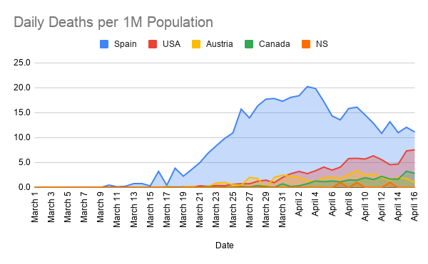
Introducing a new, 3rd measure into my framework. Here we have "Daily Deaths per 1M Population"
As opposed to TOTAL deaths, like in Part 2, DAILY deaths is NOT a cumulative total, and separately plots each days deaths (per 1M population). This measure does in fact look strictly at absolute deaths each day, so of course will tend to start small and then grow as the virus progresses. This one is also relatively straightforward, as of course we want to see the number of deaths on a daily basis go down because we can't get to 0 in Part 1, or a flat curve in Part 2 until this measure is also 0.
As you can see, and in line with the rest of the data, Spain and Austria are clearly and consistently on the decline and well beyond the peak. Canada and the US appeared to have plateaued a few days ago and then began to decrease but we then had an upwards tick 2 days ago followed by a small decrease but still relatively high numbers yesterday. So things are definitely starting to turn in the right direction for us but we aren't quite able to confidently say the peak is clearly behind us just yet. With NS, again there is so little data because of only have 3 deaths that there is really nothing but good news to report there.