
Nova Scotia Case & Test Data
Please join inFACT on the following social media platforms:
Don't forget to DONATE if you can, every little bit helps!
Nova Scotia testing data is now up to date. Given the exponential increase in testing, and the record level of cases being detected, I believe some perspective is in order.
Visual #1 - NS Testing Data
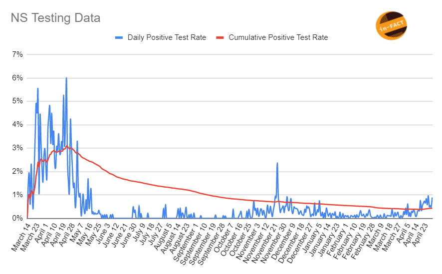
This visual illustrates, in blue, the daily positive test rate. In other words, the total cases detected divided by the total tests performed, for each day since March 14, 2020. The red line is the total, or cumulative positive test rate over time. So each day, the TOTAL positive cases (since March 2020) divided by the TOTAL tests completed (since March 2020) is being plotted. As you can see, the current daily positive test rate, whilst a bit higher than it's been recently, is still well under what we saw from March through May last year. It's hard to infer anything else at the moment because we have no data on what portion of new cases currently are coming from symptomatic vs asymptomatic testing. As a result, we can't conclude, with any accuracy, whether or not COVID-19 is actually more prevalent in our communities now vs last November or last spring. The positive test rate suggests it isn't, however, if the majority of new cases are from symptomatic people, then you could wipe out most of the asymptomatic testing and still have the same case numbers, which would drive up the positive test rate. Unfortunately, we simply don't have this data, therefore anything other than what this visual shows, is simply speculation.
Visual #2: NS Daily Tests vs Daily Cases
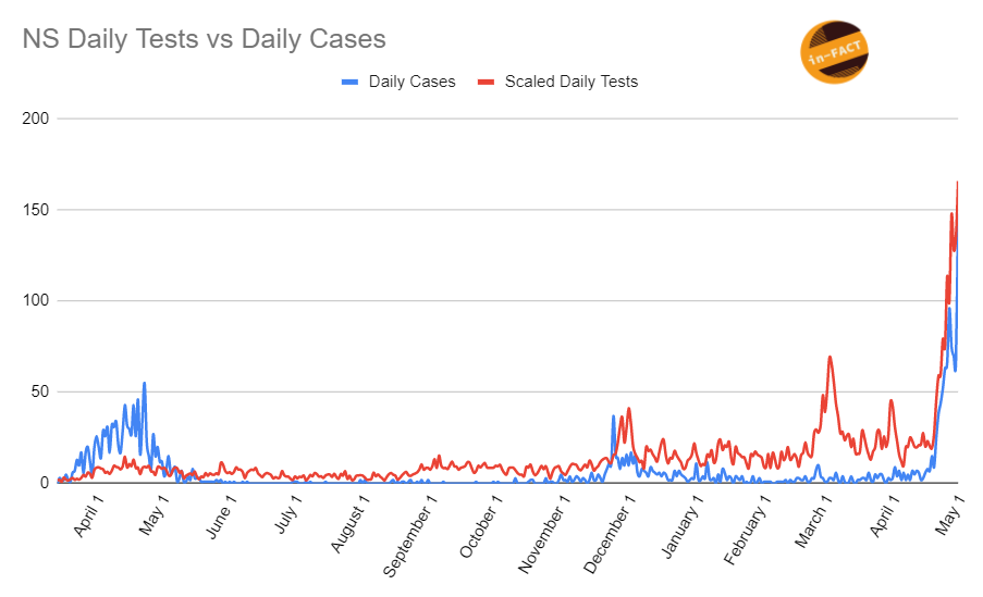
This visual adds more context to the previous commentary. The blue line is the number of daily new cases since last spring. The red line is the daily tests processed (scaled back by dividing by 100, so 10000 tests will show as 100 tests for the purposes of having a visual that is easier to show the trend and relationship between cases and tests). As you can see, to a large degree, the lines follow a similar trend, meaning as testing goes up, cases go up, and vice versa. This leads me to believe that it's likely a large enough portion worth noting, of new cases are from asymptomatic testing, which is likely (though not guaranteed) to be obtained using higher PCR cycles. Thus indicating many of these people may not be infectious. It also indicates that if we stopped promoting asymptomatic testing, that our case levels would drop significantly, and if we did asymptomatic testing last spring, we would have had a ton more cases. Again, these are just my opinions but I think they are reasonable based on the data. This would indicate that the prevalence of COVID-19 currently, is much lower than it was last spring, we are simply uncovering more people with small viral loads due to the increase in testing capacity and global nature of who now qualifies for a test, ie: everyone for any reason.
Correlation:
To further clarify my point, I did a statistical correlation between Daily New Cases, and Daily Tests Completed. Data from March 14, 2020 until today was used. The result is quite astounding. The correlation between these 2 sets of data is 0.70, or 70%. This is an INCREDIBLY STRONG correlation. This means that as testing increases, case numbers follow suit in 70% the same manner and direction as the testing. For context, a 1.0 or 100% correlation (not obtainable in any real word correlation) would mean that for every 1% increase in testing, cases would increase by exactly 1% as well, and so on. A -1.0 or -100% correlation would mean that for every 1% increase in testing, cases would decline by exactly 1%. A 0 correlation means there is absolutely no relationship between the data points, they are totally random and you cannot predict one off the other. So as you can see, a +70% correlation in incredibly strong, meaning that you can predict with a great degree of accuracy, the trends that will occur in cases, if you increase or decrease testing.